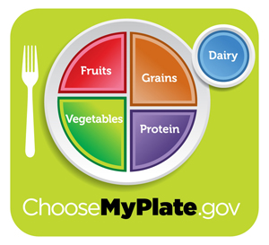
The food pyramid has been around since 1992, and this month the USDA came out with a new icon. I personally think this new icon is very simple and clear; showing an example of portion control and how much of each nutrient we should be consuming.
This is the new food plate released for June 2011 by the USDA.

More information is available at the Choose My Plate website! The website has lots of information on food groups, preparing healthy meals, tips and interactive tools.
Did the food pyramid confuse you? What do you think of the new icon?
Related posts:


![GG-Blogger-Badge[1]](/wp-content/uploads/2010/08/GG-Blogger-Badge1-150x199.jpg)
{ 3 comments… read them below or add one }
Crazy about the new food “plate” … in Canada, we have a food guide (different from the pyramid), so I wonder if it will be changing too.
I can’t decide if I like this new representation on what to eat. It may be confusing for people to see both fruits and vegetables on the plate, and I’m not sure if it represents the percentage of what we should be eating correctly. The dairy seems like an awfully big circle to me.
However, it is definitely an improvement from the last “food pyramid”!
Chloe,
Yes I’m sure I won’t be eating fruit for dinner but two servings of vegetables instead. I’m glad you pointed that out.